Hi,
Congratulations on the new design adventure.

Below, some usability tips.
Geraldine's website – http://everywhereist.com – just relaunched with a new look.We'd love any feedback you've got…
Posted by Rand Fishkin on Saturday, April 4, 2015
(note, see the bottom of the blog post for some screenshots)
What I like about the design?
- I like the fact that the colors are soft, the tones are not aggressive and this theme is kept everywhere.
- It’s interesting to see both sentences which start with small letters and BIG letter texts. It’s OK.
- I like a lot the Best Of idea. Showing in a single page the best blog posts is a good idea.
- I like the big fonts, it makes the site easy to read.
- I like the “see other recommended blog posts”. It’s a nice feature.
- I like that the header animates on mouseover.
- I like the fact that the site is responsive.
What I think might be improved?
- To me, the header is too crowded. There’s too many things about it.
- I would love to see a Contact in the header.
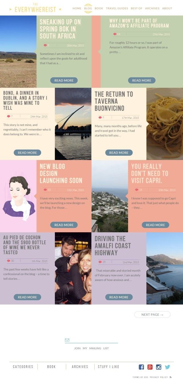
- I would prefer a linear homepage, rather than forcing me to go zig-zag with my eyes, reading for text.
- The text in the first story shows only a snippet, and is followed by “read more”. I think that due to design restraints, the text is automatically broken after a few words. In my opinion, this is a poor choice. Either have a solution to show a first sentence / paragraph, in full, giving me something to read, or don’t show any text at all. I don’t like the in-between solution, which gives me a snippet of the text, but that snippet is not so valuable, in the end.
- To me, the titles in BIG CAPITALS are hard to read. It’s OK for the logo and menus, but putting this also to blog titles is a bit too much.
- I would look for another metaphor for a travel blog. “Travel blog” = “Earth” is just too common. “Look, I travel, here’s a photo of the Earth as my logo”. It’s too common, and, if I might say, not the author’s style.
- On the same note, there are too many metaphors in the header which are too obvious. “Glasses / keys / film / photo / tickets / pen / passport / and a flower (which I don’t know for sure what is)”. Most of them don’t give me too much emotions. The glasses are fine, perhaps the passport, but I’d look for other metaphors for the rest of them.
- Regarding the Facebook page – I’d make the logo fit the square which Facebook provide, and I’d go to facebook.com/username to change the URL from “https://www.facebook.com/pages/The-Everywhereist/139975822719618” to something which looks simpler.
- On the homepage, there are two “Jump on the mailing list” boxes, I’d just keep one.
- The first page only shows 3 posts, I’d consider adding more.
- On the Book page, there’s a newsletter form which looks very common, it’s the default theme MailChimp has for embedding forms, I’d consider adding some style (Google “style MailChimp forms” and you can find pre-made templates).
- The blog says “Travel Guides” (Travel Guides | The Everywhereist), but there’s just a single travel guide. Perhaps it would be OK not to have it as a special category in the upper menu, and just add a link to Best Of page.
- There is a page for Archives (Archives | The Everywhereist). In my opinion, the page is mostly useless. WordPress has a code for a dropdown menu for archives (Function Reference/get archives « WordPress Codex), which does everything which this page does, occupying very little space. Also, it’s actually faster to just have the specified dropdown in the footer, and let the users see the page very quickly, rather than forcing them to visit “Archives”, and from there select the month. But, all-in-all, the page is, in my opinion, useless, since most people don’t really want to go and visit “Posts from February 2013”. Another point on this is that the web site should, in my opinion, list the number of blog posts in that specific month. So, April 2013 (14 posts), something like that. WordPress function specified above, as dropdown, has this option, also.
- Also, there is a page “Categories”. I’d consider not having the category “Uncategorized” (Uncategorized), it forces me to visit it, because any blog post can fit in there, so whatever I am searching for, I must visit that category. Also, I’d consider having it also as dropdown, and not a separate page. Also, the number of blog posts from each category would be an added bonus. Also, perhaps a link to RSS subscription for each category (it’s very simple, just add “/feed” to each category, but some people might not know this).
- The web site has been made into some sort of a portal, the homepage having just a glimpse of everything else. In my opinion, most visitors to the web site come for the blog posts, and the information such as “New book” or “Travel guides” only need to be presented once. So, I’d consider making the site a classic blog. I’d reference the book, the travel guides in the footer, or in the sidebar of the blog.
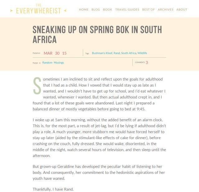
- Single blog post (Sneaking Up on Spring Bok in South Africa | The Everywhereist):
- It starts with “posted on”, “Tags”, “Posted in”, “number of comments”. I’d consider only listing the title and the date on the very top of the page, and putting “Tags” / “Categories”.
- The number of comments can be kept, but I suggest only as number, or something less intrusive. I’d move everything else on the bottom of the blog post.
- The “number of comments” should, in my opinion, have an anchor to the section of comments. So, “Comments: 7” should be clickable, and, when I click on it, should “teleport” me right to the comments area.
- There is a Facebook / Twitter / G+ share button, but, in my opinion, it would be much better to be able to press the button and directly Like / Share / Tweet / +1.
- Also, I’d consider adding “Pin It” for photos.
- Also, there is only “Share on Facebook” function, not the classical “Like” button. (they’re different, and “Like” function is quite important, I’d say)
- I personally would consider not having both tags and categories, and only keeping a single system for organizing information.
- On the homepage, the site shows the number of comments and show the date. I click on a single article, and now the date format is different, and also the comments number has now a different style. I’d focus on keeping things consistent.
- The footer: in there you can find “Stuff I like”, which is not present in the upper menu, and also not in the “Best of”. I would consider just repeating the upper menu and removing “Stuff I like” from there and just putting it in “Blog posts”. I prefer things a bit simpler and coherent, even if this means repeating.
- There’s no link in the footer to go to homepage, I’d consider adding them.
- There’s a link to a G+ page which has no blog posts. I’d consider only showing that link to Google, for Google+ Authorship, and not making it visible for the visitors, which may not find it so interesting.
- You’ll probably add some information on “Terms of use”.
- Most of the blog posts have images, and meta titles, so if I share them on social networks, they’ll look decent. But, still, you might consider adding some tags for Facebook/Google+ (The Open Graph protocol) and/or Twitter (Social Media Meta Tags: How to Use Open Graph and Cards).
Keep up the good work, I’ve read some blog posts from time to time.